How to master nextjs images
You’ve created a new nextjs app and now you want to add an image. A quick search shows you there is a specific nextjs image component. You smack that onto your page but you quickly realize it doesn’t behave as you want it to. Your styles are not applied as expected, and it behaves weirdly when resizing the viewport.
So you go back to using the basic HTML img tag. But it doesn’t feel right. It feels like you don’t get everything you can out of nextjs.
Use nextjs image to get a great score on core web vitals and improve SEO.
Before we get into the details of how nextjs image works, let’s quickly learn why we should use it.
The nextjs image component is an extension of the img tag. The main benefit of using it is to get better scores on core web vitals. Core web vitals are used by google to determine how to rank your site. It measures the following:
- Largest Contentful Paint (LCP) measures how quickly your site loads.
- Cumulative Layout Shift (CLS) measures visual stability
- First Input Delay (FID) measures how long it takes for your site to become interactive.
The nextjs team has gone all-in to make nextjs images optimize for the best possible score. It doesn’t load images that the user hasn’t scrolled to yet, and it serves smaller images for mobile than for desktop, etc.
However, this comes at a cost. The nextjs image component is a bit more complex than the HTML img tag, and it breaks how the img tag works completely which is super confusing.
We can mainly “blame” Cumulative Layout Shift for this. The nextjs team had to make many of its design decisions based on this.
To be able to understand nextjs image we must first understand what Cumulative Layout Shift is and how to solve it. Only then do we know how nextjs image works and why it is designed the way it is.
How nextjs images score well on Cumulative Layout Shift
CLS measures visual stability. What does that mean?
This is an example of a website with poor visual stability:
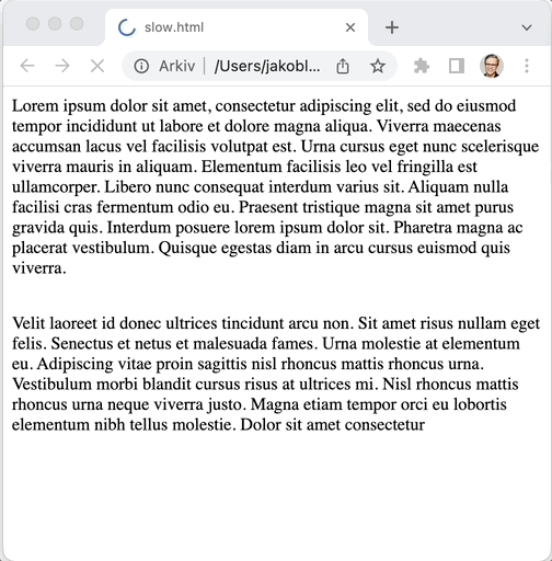
Note how the text moves after the image has loaded. This is super annoying for the reader. That is why google punishes sites with poor visual stability.
How nextjs improves visual stability
Nextjs has a solution to this problem. The reasoning is the following: if the browser knows the dimensions of the image before it has fetched it then it can reserve enough space for it. The way to do that is to always explicitly set the width and height of the images.
Let’s look at the example above but with the width and height specified in the HTML
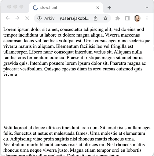
See, no layout shifts anymore!
What does that mean for you as a nextjs dev?
Nextjs must know the dimensions of the image during build time. This is key to understand to understanding how nextjs image component works.
There are two “types” of nextjs images: local images and remote images. Let’s look into both of these two types and how nextjs can know the dimension of these images.
Local or remote nextjs images are handled differently
Nextjs image handles local and remote images very differently. The reason is that nextjs must know about the height and the width of the image build time as we just learned.
The easiest way to learn the difference is to look at examples.
Local nextjs image example
A local image is an image that is hosted inside your nextjs application, commonly under the public folder.

To use a local image you first have to import it just like you import JavaScript files:
import logoImage from "../public/logo.png"You must also import the nextjs image component:
import Image from "next/image"Then you can use the local image in the nextjs image component like this:
<Image src={logoImage} alt="The logo of my company" />When you use a local image in the Image component, there are no required attributes (other than src). This is very different from when you use a remote nextjs image, as we’ll look at next.
Remote nextjs images from an external URL
A remote nextjs image is an image that is hosted outside your app. It could be on a CDN, S3, or anywhere on the internet. That means it’s not located in your public directory in the project.
The way you use a remote image in the nextjs image component is to just pass in the URL of the image in the src field:
<Image
  src="https://assets.vercel.com/image/upload/q_auto/front/assets/design/white-nextjs.png"
  alt="The logo of next"
  width={72}
  height={16}
/>
Also, you must add the domain of the assets to next.conf.js:
const nextConfig = {
  images: {
    domains: ["assets.vercel.com"],
  },
}

module.exports = nextConfig
Otherwise, you get this error message
Error: Invalid src prop (https://assets.vercel.com/image/upload/q_auto/front/assets/design/white-nextjs.png) on `next/image`, hostname "assets.vercel.com" is not configured under images in your `next.config.js`
See more info: https://nextjs.org/docs/messages/next-image-unconfigured-host
Note that I now pass in height and width attributes. This is the way nextjs knows how large the image is before it is loaded
These attributes are required when you use a remote image. The reason is that nextjs doesn’t know during build time what sizes these images have. Because it’s on a remote server, nextjs doesn’t have control over them and they might change anytime. So you have to provide the dimensions to the component.
The default behavior of scaling nextjs images can be confusing
Nextjs image works a bit differently with scaling images than the original img tag.
Scaling of images based on viewport size
One surprising thing is that nextjs images are resized when you change the browser size even though you set the width and height property.
This is not how the default behavior is for an HTML img tag. If you set the height or width for a regular HTML img tag then the height or width is fixed.
Now that we know more about the philosophy behind nextjs images, we can understand the reasoning why it’s designed like this. As we talked about earlier in this article, you are required to set width and height for remote images to avoid layout shifts. However, the most common scenario is that you still want the image to resize when the viewport resizes. So I think this default makes sense.
So what should you do if you don’t want the image to scale when you change viewport size? Set the layout attribute to fixed, like this:
<Image
  src="https://assets.vercel.com/image/upload/q_auto/front/assets/design/white-nextjs.png"
  alt="The logo of next"
  width={72}
  height={16}
  layout="fixed"
/>
Examples of different nextjs image layouts
The layout attribute has more options. You can use this attribute to change how the image behaves when the viewport is resized. There are docs for layout but in my opinion it was not a good starting point for learning. So I have created some real-world examples that I see people are struggling with.
Example1: scaling the width of the nextjs image to the same width as the container
Now let’s look into something that can be a bit confusing with nextjs images.
Let’s say you have a wrapping div, that has a fixed width that is smaller than your image.
<div className={styles.imageContainer}>
  <Image
    src="https://dummyimage.com/640x360"
    alt="Dummy image"
    width={640}
    height={360}
  />
</div>.imageContainer {
width: 200px;
}In this case, the image is scaled down correctly. It will be a maximum of 200px, and the height will be scaled down proportionally (keeping the same aspect ratio). This is the same behaviour as if you would use an img tag with width: 100% and height: auto
However, if you have a container that is larger than the image and you want to scale the image up to the size of the container, then you must change the layout attribute to responsive.
<div className={styles.imageContainer}>
  <Image
    src="https://dummyimage.com/640x360"
    alt="Dummy image"
    width={640}
    height={360}
    layout="responsive"
  />
</div>.imageContainer {
width: 800px;
}Example2: Scaling the height of the nextjs image to the same height as the container
Let’s say you have a wrapping div, that has a fixed height
You want your image to scale down to the height of the container, and the width should scale down accordingly (keeping the same aspect ratio).
This is a bit trickier.
We can see in the docs that the layout attribute responseive only scales to fit the width of the container. And there are no corresponding value to use to scale to fit the height of the container. So we need to do a hack.
The best thing I have found is the following. We create a wrapping div around the nextjs image with css styles like the following:
<div className={styles.imageContainer}>
  <div style={{ width: "100%", height: "100%", position: "relative" }}>
    <Image
      src="https://dummyimage.com/640x360"
      alt="Vercel Logo"
      width={640}
      height={360}
      layout="fill"
      objectFit="contain"
    />
  </div>
</div>.imageContainer {
height: 100px;
}When we do it like this, the wrapping div scales to fit the container div and the nextjs image component scales to fit the wrapping div because we use layout="fill". A bit hacky, but I guess we have to live with it.
Now let’s move over to a completely different pain point with nextjs images: styling.
Styling a nextjs image component
Styling nextjs images is a huge pain for many devs. With a regular img tag, you can just add styling by adding a className that has CSS styling such as border , width, etc. If you do that with the nextjs image component then sometimes nothing will happen. Let’s explore why.
Why is styling nextjs image so difficult?
First, let’s look inside the chrome developer console to see what DOM elements are created when you use the nextjs image component.
I create a nextjs image like this:
<Image
  src="https://www.hdnicewallpapers.com/Walls/Big/Dog/Dog_Running_on_Grass_Image.jpg"
  width={850}
  height={480}
  alt="dog"
/>
Then these DOM elements are created:
<span style="box-sizing:border-box;display:inline-block;overflow:hidden;width:initial;height:initial;background:none;opacity:1;border:0;margin:0;padding:0;position:relative;max-width:100%">
<span style="box-sizing:border-box;display:block;width:initial;height:initial;background:none;opacity:1;border:0;margin:0;padding:0;max-width:100%">
<img style="display:block;max-width:100%;width:initial;height:initial;background:none;opacity:1;border:0;margin:0;padding:0" alt="" aria-hidden="true" src="data:image/svg+xml,%3csvg%20xmlns=%27http://www.w3.org/2000/svg%27%20version=%271.1%27%20width=%27850%27%20height=%27480%27/%3e">
</span>
<img alt="dog" src="/_next/image?url=https%3A%2F%2Fwww.hdnicewallpapers.com%2FWalls%2FBig%2FDog%2FDog_Running_on_Grass_Image.jpg&w=1920&q=75" decoding="async" data-nimg="intrinsic" style="position:absolute;top:0;left:0;bottom:0;right:0;box-sizing:border-box;padding:0;border:none;margin:auto;display:block;width:0;height:0;min-width:100%;max-width:100%;min-height:100%;max-height:100%" srcset="/_next/image?url=https%3A%2F%2Fwww.hdnicewallpapers.com%2FWalls%2FBig%2FDog%2FDog_Running_on_Grass_Image.jpg&w=1080&q=75 1x, /_next/image?url=https%3A%2F%2Fwww.hdnicewallpapers.com%2FWalls%2FBig%2FDog%2FDog_Running_on_Grass_Image.jpg&w=1920&q=75 2x">
<noscript>
<img alt="dog" srcSet="/_next/image?url=https%3A%2F%2Fwww.hdnicewallpapers.com%2FWalls%2FBig%2FDog%2FDog_Running_on_Grass_Image.jpg&w=1080&q=75 1x, /_next/image?url=https%3A%2F%2Fwww.hdnicewallpapers.com%2FWalls%2FBig%2FDog%2FDog_Running_on_Grass_Image.jpg&w=1920&q=75 2x" src="/_next/image?url=https%3A%2F%2Fwww.hdnicewallpapers.com%2FWalls%2FBig%2FDog%2FDog_Running_on_Grass_Image.jpg&w=1920&q=75" decoding="async" data-nimg="intrinsic" style="position:absolute;top:0;left:0;bottom:0;right:0;box-sizing:border-box;padding:0;border:none;margin:auto;display:block;width:0;height:0;min-width:100%;max-width:100%;min-height:100%;max-height:100%" loading="lazy"/></noscript>
</span>Two important things to note here:
- There is a wrapping
spanelement around theimgtag - There are inline styles on the
imgelement containing the most common styles such aswidth,height, andborder
When you add a custom style with className or style attribute, then it will apply that style to the img element. BUT: the img element already has inline styles which will take precedence (they will take precedence because they are inline-styled).
The following inline styles are already on the img element
width, height, border, position, top, left, bottom, right, box-sizing, padding, margin, display, min-width, max-width, min-height, max-height
That means you cannot easily do common styling of images using the CSS rules above.
Let’s look at how to work around it.
How to style nextjs images
There are different work-arounds depending on your needs. One acceptable solution in some cases could be to add !important to your styles. In that case, it would take precedence over the inline styles on the nextjs img element. However, we have learned to be cautious when using !important. It’s not a good practice to throw around it so only use it if you have thought about it carefully.
If you don’t want to use !important there are other ways to work around it. What the solution is dependens on your use case. I share some examples of common styling problems of nextjs images and proposed solution.
How to center nextjs image
A common task is to center an image. Our go-to method to do this for regular HTML img elements is to just add a margin: auto to the image. However, if you look at the CSS styles that cannot be styled in the list above, you’ll see margin.
A good solution to this problem is to use a wrapping div instead.
<div
  style={{
    display: "flex",
    justifyContent: "center",
  }}
>
  <Image
    src="https://www.hdnicewallpapers.com/Walls/Big/Dog/Dog_Running_on_Grass_Image.jpg"
    width={250}
    height={180}
    alt="dog"
  />
</div>
How to make rounded corners
Making rounded corners on the image is something that works as expected. the reason is that the CSS class border-radius is not applied by default by nextjs image. You can add border-radius to the component the way you expect. This is an example:
<Image
  style={{
    borderRadius: "20px",
  }}
  src="https://www.hdnicewallpapers.com/Walls/Big/Dog/Dog_Running_on_Grass_Image.jpg"
  width={850}
  height={480}
  alt="helo"
/>
Further reading
This article by the dev team behind nextjs image is useful for learning more about the design decisions they have made to support Cumulative Layout Shift
In the official docs there is an overview of nextjs image which is quite good